The ask.
Update category pages to address the most prominent consumer pain points, incorporate top keywords, and add visual elements to make product differentiators obvious to the everyday consumer.
Materials provided: strategy brief, SEO keywords, product information.
How I helped:
Worked alongside client-side product teams to uncover more helpful information for consumers.
Met with the CX team to determine where we could incorporate videos instead of copy.
Created concise product comparison charts to help users better understand the difference between various products.
QA’d design work to ensure photography matched the content it accompanied and site designs were in line with the brand’s guidelines.
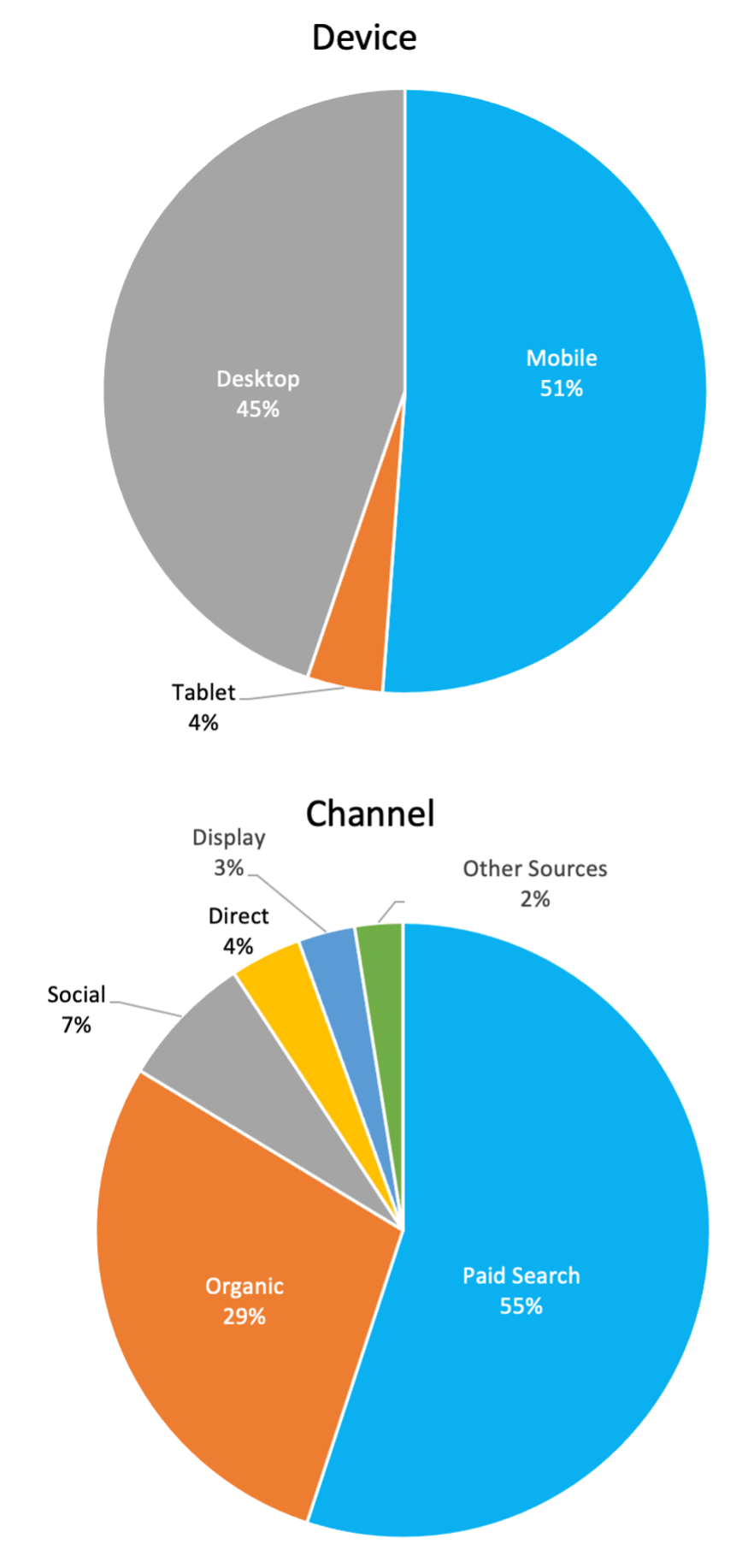
Insights from Google Analytics helped us focus our efforts on Desktop and Mobile and understand that most users landing on the site were already searching for and interested in related products.
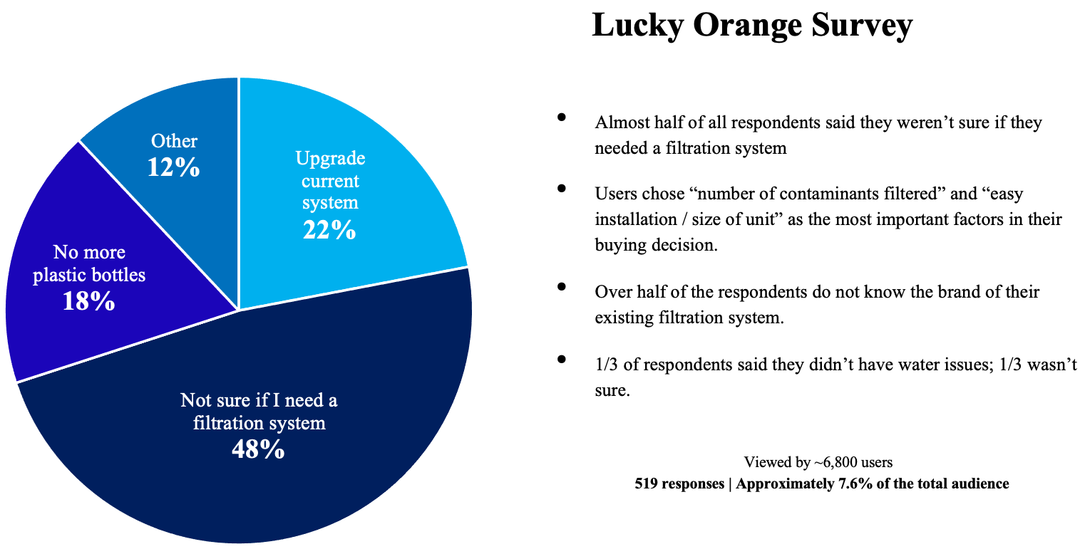
Having the time and budget to collect audience feedback on the products and consumer purchase journey allowed us to understand to both educate consumers and get them to convert.
Asking the audience.
Keeping eyes on the prize.
We know that users typically scan a page in an F-pattern — reading the first headline, descending until they land on a keyword that resonates with their search intent, and then reading horizontally again. Along with the insights from the Lucky Orange Survey, this helped us determine the proper messaging hierarchy.
Process.
Step 1: Research.
While I was provided technical product manuals for each category page, I often met with client-facing product teams before writing. This allowed me to understand key product features that differentiate Culligan’s systems from their competitors.
Step 2: Writing.
For the first page of the project, we crafted copy before designs. As so, I worked with UX to develop wireframes that could help shape copy and better help us organize key message points throughout the page.
Step 3: Revisions & recommendations.
All pages underwent a multi-step revision process. Articles were first reviewed internally by SEO, CX and Design and then sent to the client for two rounds of revisions. In the event of pushback, I ensured we always had the UX data to back up our decisions.


